

My daughter and hubby are gonna throttle me when they read this, and I won't blame them a bit. You see, a while back John suggested we might tear out the awkward tub/shower in our upstairs bath someday, and replace it with a convenient walk-in shower. We have a big comfy claw-footed tub downstairs that's perfect for soaking, and a walk-in will be much easier to manage when we are older. Also, the checkerboard linoleum in our bath and kitchen isn't holding up too well -- lots of divots, cracks and stains -- so we should probably replace that at the same time.
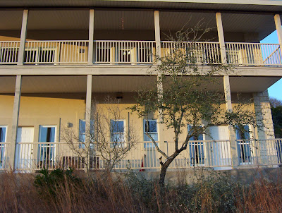
I wasn't sure what to think of that floor when I first saw it. It was a mighty bold statement for such a small space, but I have grown accustomed to it over time, and it shows up really well in blog photos! Plus, it suited the 40's retro look that the original owners favored -- white walls and cabinets, black countertops, straight lines, no frills other than a bit of beaded board paneling and simple chrome handles and knobs. It fit with the outside of the house as well, which, though it was stucco, had a bare bones country farmhouse look to it.
Knowing how I tend to mull things over for months, if not years, before deciding exactly what I want, John decided to hire our daughter, the interior designer, to oversee this project and speed my decision-making process along. When they asked me what I wanted, I told them that I've always favored Saltillo tile floors and bold colors in my kitchens, but since the black counters and white cabinets are still in great shape, and we couldn't afford to replace them anyway, "I suppose we should probably stick with the black and white theme, huh?" They took that ball and ran with it!
Within a couple of days John had sent Lex all kinds of pictures of b&w kitchens and baths he'd found on the internet, and within a couple of weeks Lex had designed an absolutely gorgeous kitchen/bath combo with little octagon-shaped black and white tiles on the floor. The shower was to have white subway tiles, with an accent border of b&w recycled glass tiles, and a huge, vintage-looking brushed-nickel shower head that I love. She did a fabulous job with the parameters she was given. There's only one problem. I'm just not sure it really goes with the house itself.
Like everything else, this house has morphed into something else over the past six years. It all started with our archi-friend Bob. He designed this house for its original owners, so we looked him up when we decided to create a dining room by enclosing part of the upper porch. He said he'd be delighted to assist us, for it would give him the opportunity to correct a mistake that had been chafing him for years. He hated the tall spindly columns that supported the upper porch and made the two floors look disproportionate, but he'd had no choice at the time. He suggested we remedy the situation by adding the limestone arches across the lower porch. We were so happy with the results, we turned to him again when it came time to create a front garden, and now we have the adobe style portal with ocotillo-like fencing.
So, as you can see, our house has gone from Plain Jane farmhouse to Tex-Mex hacienda, and it's got me to thinkin' that, perhaps the inside of the house should be more in keeping with that transformation. But. How does one make white laminate cabinets and black Corian counters and back-splash exude hacienda ambience?


No comments:
Post a Comment